Color Theory for Graffiti Artists: Choosing the Perfect Palette
In the world of urban art, color is more than just a visual choice; it is a language of energy, visibility, and style. Whether you are painting a legal mural or practicing your first tags, understanding how colors interact can mean the difference between a piece that "pops" and one that fades into the background. At Graffitifun, our team of over 42 professional artists has spent more than two decades mastering the nuances of aerosol pigment. We’ve guided thousands of participants through graffiti workshops, teaching them that a great piece starts long before the cap is pressed. Choosing the perfect palette requires a balance of technical knowledge, environmental awareness, and creative intuition. This guide explores the essential principles of color theory specifically tailored for the graffiti medium.
The Foundation: Understanding the Color Wheel in Spray Paint
The color wheel is the fundamental tool for any visual artist, but for graffiti writers, it serves as a roadmap for legibility. Graffiti is often about contrast—making sure your "fill-in" stands out against your "outline." By understanding the relationships between colors, you can create pieces that are harmonious or intentionally jarring.
- Primary Colors: Red, Blue, and Yellow. These are the building blocks. In graffiti, these are often used for high-impact, old-school styles.
- Secondary Colors: Green, Orange, and Violet. These are created by mixing primaries. They offer a more modern, "funky" feel to pieces.
- Tertiary Colors: These are the shades in between, such as teal or magenta, which add depth and sophistication to a mural.
When we host team building workshops, we often teach the "60-30-10" rule. This suggests using a dominant color for 60% of the piece (usually the fill), a secondary color for 30% (the outline or 3D effect), and an accent color for 10% (the highlights or "force field"). Understanding these ratios ensures that your palette doesn't become a muddy mess, keeping each element distinct and vibrant.
Mastering Contrast: Complementary vs. Analogous Schemes
Contrast is the "secret sauce" of graffiti. Because spray paint is applied in layers, the relationship between the background and the foreground is critical. The two most common strategies used by our professional artists are complementary and analogous color schemes.
Complementary Colors sits opposite each other on the color wheel (e.g., Purple and Yellow, Blue and Orange). These pairings create the highest level of visual tension. If you want your piece to be visible from a distance—a hallmark of classic street art—using a complementary outline is the most effective method. For example, a bright lime green fill with a deep purple outline is a classic combination that screams for attention.
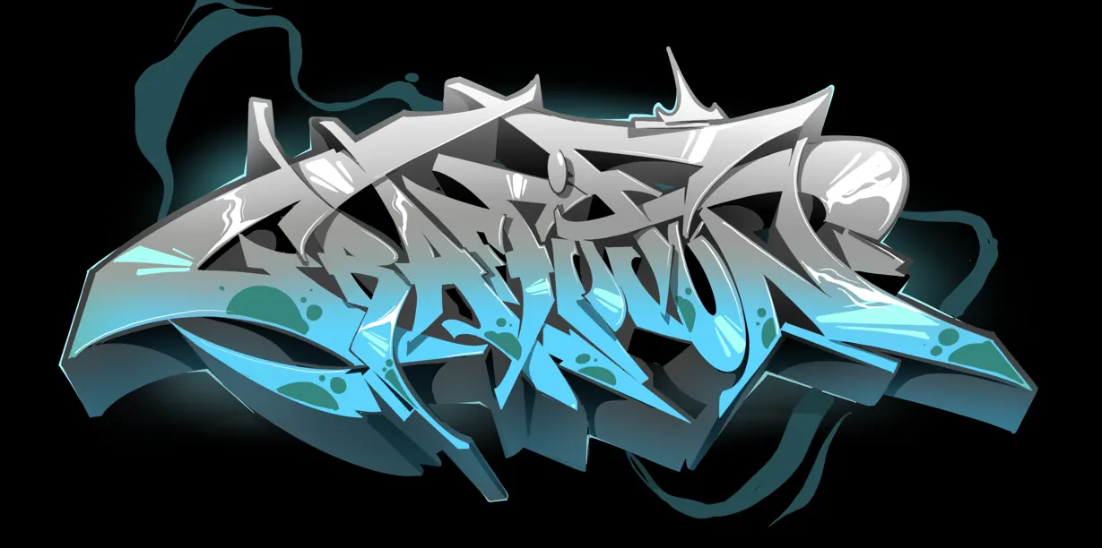
Analogous Colors sit next to each other on the wheel (e.g., Blue, Teal, and Green). These schemes are naturally pleasing to the eye and create a sense of unity. We frequently use analogous palettes in graffiti workshops for schools because they are harder to "mess up." They create a smooth, gradient effect that looks professional and polished. However, when using an analogous scheme, you must use a neutral "power line"—like a sharp white or black—to prevent the colors from blending into one another too much.
The Psychology of Color in Public Spaces
Colors evoke emotions, and in graffiti, the mood of your piece can change based on the environment. As a company with 20+ years of experience, we have seen how different palettes affect the atmosphere of a space. When choosing your colors, consider the "vibe" you want to project:
- Warm Colors (Red, Orange, Yellow): These radiate energy, passion, and urgency. They are perfect for high-traffic areas or brand activation events where you want to grab immediate attention.
- Cool Colors (Blue, Green, Violet): These are calming, professional, and receding. They work exceptionally well for large-scale murals in office spaces or community centers where you want the art to enhance the environment without overwhelming it.
- Neutrals (Black, White, Grey, Chrome): In graffiti culture, chrome and black are legendary. They represent efficiency and "silver" pieces that are designed for speed and maximum reflection.
Our artists often suggest looking at the surrounding architecture before picking a palette. Is the wall red brick? Avoid dark reds unless you want the piece to disappear. Is it a grey concrete wall? Almost any vibrant color will sing against that neutral canvas.
Value and Saturation: Creating 3D Depth
One of the most common mistakes beginners make is choosing colors that are all the same "value." Value refers to how light or dark a color is. If you squint at your piece and everything looks like the same shade of grey, your colors lack sufficient value contrast.
To create a 3D effect—a staple of "Wildstyle" graffiti—you need a range of values:
- The Highlight: The lightest version of your color, often used on the top edges where "light" would hit the letters.
- The Mid-tone: Your primary fill color.
- The Shadow: A darker version of your fill, used for the 3D depth or "drop shadow."
Saturation refers to the intensity of the color. A highly saturated neon pink will jump forward, while a desaturated, dusty rose will recede. By mixing high-saturation colors for your "bits" (the extra decorative elements) and lower-saturation colors for the background, you create a sense of atmospheric perspective. This technique is what gives professional murals their "pop" and makes them appear to leap off the flat surface of the wall.
Practical Tips for Testing Your Palette
Before you touch the wall, you need a plan. Professional graffiti artists rarely "wing it" when it comes to color. Here are several practical ways our team at Graffitifun prepares for a project:
- Digital Sketching: Use apps like Procreate or Photoshop to test color combinations on a photo of the actual wall. This is a standard practice for our corporate mural commissions.
- The "Cap Test": Always spray a small dot of each color on a piece of cardboard or the bottom of the wall to see how they look in the actual light of the day. Colors look different in the sun than they do on a computer screen or the can’s "donut" (the plastic ring around the nozzle).
- Limit Your Selection: Especially for beginners, less is often more. Start with a palette of 3 to 5 colors. This forces you to be creative with how you layer them and ensures the final result remains cohesive.
- Consider the "Cut": In graffiti, we use a technique called "cutting in" where we use the background color to sharpen the edges of the letters. Ensure you have enough of your background color to fix any mistakes.
Whether we are conducting corporate graffiti workshops or creating a massive outdoor mural, these preparation steps ensure the final palette reflects the client's vision while maintaining the raw edge of the graffiti aesthetic.
Conclusion: Finding Your Unique Style
Color theory is a science, but graffiti is an art. While the rules of contrast, value, and the color wheel provide a solid foundation, some of the most iconic pieces in history have succeeded by breaking those very rules. The goal of understanding color theory is not to limit your creativity, but to give you the tools to express it more effectively. By mastering the perfect palette, you ensure that your work is not only seen but felt.
Are you ready to take your skills to the next level and learn from the best in the industry? At Graffitifun, we bring over two decades of street art expertise to every session. Whether you are looking for a unique team-building experience, an educational school program, or a high-impact brand activation, our team of 42+ professional artists is here to guide you.
Book your graffiti workshop today and let's bring some color to your world!
Ready to Create Your Masterpiece?
Book your graffiti workshop today and discover the artist within! It's going to be AWESOME!