Typography and lettering in graffiti: a designer's perspective
Dive into the vibrant intersection of graffiti and design. This post explores how street art's unique typography and lettering styles offer a fresh perspective for designers, influencing everything from branding to digital interfaces. Discover the raw energy and creative innovation found on city walls.
Typography and Lettering in Graffiti: A Designer’s Perspective
In the world of visual communication, typography is often seen as a rigid discipline governed by grids, kerning, and legibility. However, from a designer’s perspective, graffiti represents the ultimate evolution of the written word—a place where letters break free from the constraints of the baseline to become living, breathing architecture. At Graffitifun, with over 20 years of experience and a collective of 42+ professional artists, we have witnessed the intersection of traditional graphic design and raw street aesthetics. Graffiti is not just "writing on walls"; it is a complex system of letterform manipulation that challenges every conventional rule of typography while maintaining its own internal logic and flow.
The Anatomy of the Letter: Beyond the Font
To a graphic designer, a letter is a static glyph. To a graffiti artist, a letter is a skeletal structure that can be stretched, twisted, and armored. The fundamental difference lies in the concept of the "bar." In traditional typography, we speak of stems, ascenders, and descenders. In the graffiti world, we focus on the integrity of the letter’s bones. Even in the most complex "Wildstyle" pieces, a professional artist ensures that the underlying structure is sound.
Understanding this anatomy is crucial for anyone attending our graffiti workshops. We teach participants how to:
- Identify the Core: Stripping a letter down to its simplest form before adding "swing" or "funk."
- Balance Weight: Ensuring that the visual heaviness of one side of a letter is offset by an extension or "arrow" on the other.
- Master Connections: Learning how letters flow into one another, creating a cohesive unit rather than a string of isolated characters.
By viewing graffiti through a designer’s lens, we see that it follows many classic design principles—hierarchy, rhythm, and contrast—but applies them in a 3D space where the "canvas" is often an irregular urban surface.
From Throw-ups to Wildstyle: A Study in Legibility
One of the most fascinating debates in design is the balance between form and function. In typography, function usually means legibility. In graffiti, however, the "function" is often identity and style, which can sometimes lead to intentional illegibility as a form of visual encryption.
- Tags: The "logo" of the artist. It’s about muscle memory, speed, and line quality.
- Throw-ups: These are the "bold fonts" of the street—bubble letters that prioritize volume and speed over intricate detail.
- Blockbusters: Large, rectangular letters designed for maximum readability from a distance, much like billboard typography.
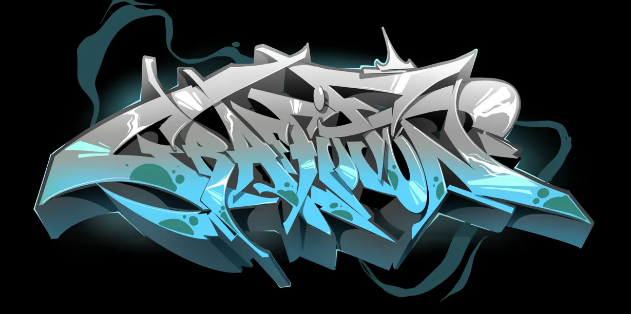
- Wildstyle: The peak of typographic complexity. Here, letters are merged with arrows, spikes, and mechanical elements, creating a visual puzzle that only those "in the know" can decode.
At Graffitifun, we often explore these styles during our team building workshops. We show corporate teams how the evolution of a letterform mirrors the evolution of a brand—moving from a simple idea to a complex, multifaceted identity.
The Psychology of Color and Shadow in Street Lettering
In digital design, we use drop shadows and gradients with a click of a button. In the world of graffiti, these are manual skills that require an intimate understanding of light sources and depth perception. A designer looks at a graffiti piece and sees more than just bright colors; they see a sophisticated use of "3D" (the thickness of the letter) and "Forcefields" (the outer glow or outline that separates the piece from the background).
Our professional artists emphasize that color choice in graffiti isn't random. It serves several purposes:
- Contrast: Using a "Powerline" (a bright outer stroke) to make letters pop against a dark wall.
- Directional Lighting: Consistently placing shadows on the same side of every letter to create a sense of physical weight.
- Mood: Warm tones can evoke energy and aggression, while cool blues and purples might suggest a more technical, "frozen" aesthetic.
When we facilitate a brand activation, we utilize these psychological color triggers to ensure that the client's message isn't just seen, but felt. The tactile nature of spray paint allows for blending and "fading" that mimics high-end digital gradients but with a raw, authentic texture that resonates with modern audiences.
Breaking the Grid: Composition and Flow
Traditional layout design relies heavily on the grid. Graffiti, however, uses the "Flow." This is the invisible line that connects a series of letters, ensuring they move together like a single organism. From a designer’s perspective, this is the ultimate lesson in kerning and tracking. If one letter is too far apart or tilted at the wrong angle, the "swing" of the entire piece is ruined.
In our workshops for schools and professional settings, we teach the concept of "The Lean." This is how letters can tilt forward to suggest momentum or backward to suggest stability. We also look at:
- Overlapping: How much of one letter can cover another without losing the word’s identity?
- Extensions: Adding decorative elements that fill "negative space"—the empty areas between letters that designers are often taught to leave blank.
- Baseline Variation: Moving letters up and down the vertical axis to create a dancing, rhythmic effect.
This mastery of space is what separates an amateur from a professional with decades of experience. It’s about knowing when to follow the rules of geometry and when to deliberately break them to create something unique.
The Digital Transition: Graffiti’s Influence on Modern Graphic Design
The influence of graffiti on modern typography is undeniable. From the gritty textures in "grunge" design to the fluid, hand-drawn aesthetic of modern "Script" fonts, the streets have moved into the studio. Professional designers now look to graffiti for inspiration on how to create "bespoke" typography—lettering that cannot be replicated by a standard font file.
At Graffitifun, we bridge this gap. Our artists often work on digital platforms, translating their physical wall skills into vector art and brand identities. This cross-pollination has led to:
- Custom Logotypes: Brands seeking a "hand-done" feel that suggests authenticity and street-cred.
- Environmental Design: Using the scale of graffiti to transform office spaces and retail environments.
- Typography as Art: A shift where the letter itself is the hero of the design, not just the carrier of information.
Whether we are hosting graffiti workshops for schools or working with Fortune 500 companies, we highlight that the spray can is simply another tool in the designer’s toolkit—one that offers a level of freedom and scale that a mouse and monitor simply cannot provide.
Conclusion: Mastering the Art of the Letter
Typography in graffiti is a masterclass in balance, rhythm, and personal expression. From a designer's perspective, it offers a refreshing departure from the "clean and clinical" world of modern UI/UX, reminding us that letters are more than just data—they are art. With 20+ years of heritage and a team of 42+ professional artists, Graffitifun remains at the forefront of this movement, teaching the world how to see the beauty in every stroke and the logic in every "wild" connection.
Are you ready to transform your team's perspective on creativity and communication? Whether you are looking for a unique team-building experience, an educational school program, or a high-impact brand activation, our experts are ready to guide you through the vibrant world of graffiti lettering.
Contact Graffitifun today to book your workshop and start your journey into the art of the street!
Ready to Create Your Masterpiece?
Book your graffiti workshop today and discover the artist within! It's going to be AWESOME!