Lettering styles guide: From basic tags to wildstyle masterpieces
Complete guide to graffiti lettering styles: tags, throw-ups, blockbusters, wildstyle and 3D. Step-by-step tutorial with images for beginners and pros.
Graffiti lettering is one of the most recognizable art forms in the world. From quick tags on a mailbox to massive wildstyle murals covering entire buildings, lettering is the beating heart of graffiti culture. Every writer starts with letters — and the best never stop refining them.
This guide takes you through every major lettering style, from the simplest tag to the most complex wildstyle composition. Whether you're picking up a marker for the first time or looking to push your style further, you'll find practical techniques, visual breakdowns, and pro tips to level up your letter game.
Introduction to graffiti lettering
At its core, graffiti is about letters. While murals and characters have expanded the art form, lettering remains the foundation that separates graffiti from other street art disciplines. Understanding letter structure — how strokes connect, how weight distributes, how negative space works — is essential for every style.
The main graffiti lettering styles, ordered from simple to complex:
- Tags — your stylized signature
- Throw-ups — quick two-color bubble letters
- Blockbusters — large, simple letters for maximum coverage
- Wildstyle — complex interlocking compositions
- 3D lettering — adding depth, shadows and perspective
Each style serves a different purpose and requires different skills. Mastering them in order builds a solid foundation.
Step-by-step: How to create graffiti letters
Before diving into specific styles, here's the universal process for creating any graffiti piece. Follow these five steps and you'll go from blank paper to finished artwork.
Step 1 — Sketch your basic letters

Start with simple block letters on paper. Don't worry about style yet — focus on even spacing, consistent sizing, and clean lines. Write your word in plain capital letters first, then start playing with proportions. Make some letters wider, others taller. This skeleton determines the flow of your entire piece.
Use graph paper or draw light guidelines to keep your letters aligned. Consistent baselines and cap heights make even simple letters look professional.
Step 2 — Add volume and thickness

Now thicken your letters by drawing parallel lines around each stroke. This transforms flat letters into dimensional shapes. For bubble letters, round off every corner and exaggerate curves. For blocky styles, keep edges sharp and angles consistent. The key is uniformity — every letter should have roughly the same stroke width.
Step 3 — Define outlines and connections

Go over your letters with a thick marker or pen to create clean, bold outlines. This is where you can add stylistic elements: arrows extending from letter terminals, connections between overlapping letters, and decorative bits like crowns, stars, or underlines. Keep the outline confident — hesitant lines show immediately.
Step 4 — Apply color and shadow

Fill your letters with color, working from the inside out. Apply your base color first, then add gradients or second colors for depth. Add a drop shadow behind each letter to make the piece pop off the wall. The shadow should be consistent — pick one light source direction and stick with it for every letter.
Step 5 — Final details and effects

The finishing touches bring everything together. Add highlights (white flicks on the upper-left edges), force fields (thin lines following letter contours), background shapes, and decorative elements. These details separate a good piece from a great one. Don't overdo it — sometimes a few well-placed highlights are all you need.
Tag style — Your signature
Tags are the most fundamental form of graffiti lettering. A tag is your stylized name, written quickly in a single color. It's your identity on the street and the first thing any writer develops.
What makes a good tag:
- Flow — letters connect naturally without awkward breaks
- Consistency — it looks the same every time you write it
- Readability — stylized but still legible
- Speed — can be executed in seconds
- Personality — reflects your unique style
Practice your tag thousands of times until it becomes muscle memory. Fill entire notebooks. Try different markers — chisel tips, round tips, mops. Each tool creates a different character.
Study handwriting calligraphy alongside graffiti tags. Understanding stroke weight, baseline variation, and letter spacing from traditional calligraphy will make your tags significantly more refined.
Throw-ups — Speed meets style
Throw-ups (or "throwies") are the workhorse of graffiti. They're quick, two-color pieces using bubble letters — typically an outline color and a fill color. Designed to be painted in under five minutes, they balance visibility with speed.
Key characteristics:
- Two colors maximum (outline + fill)
- Rounded, bubble-shaped letters
- Usually 2-3 letters (initials or short name)
- Quick execution — designed for speed
- Often done in large quantities for area coverage
The best throw-ups look effortless but consistent. Practice the same word repeatedly until you can paint it identically every time, at speed, without sketching first.
Blockbusters — Maximum impact
Blockbusters are all about size and coverage. These large, simple block letters are designed to fill as much space as possible. Often seen on rooftops, highway walls, and train cars, blockbusters prioritize readability from a distance over stylistic complexity.
Techniques for effective blockbusters:
- Use two contrasting colors for maximum visibility
- Keep letter shapes simple and geometric
- Fill with rollers for speed on large surfaces
- Use spray cans only for outlines and details
- Maintain consistent letter width and spacing
While they seem simple, great blockbusters require precision. Uneven spacing or inconsistent letter weights are immediately visible at scale.
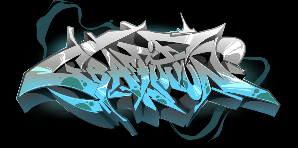
Wildstyle — The art of complexity
Wildstyle is where graffiti lettering becomes high art. Letters interlock, overlap, twist, and morph into complex compositions that can take hours to plan and execute. Arrows, connections, and decorative elements weave through the letters, creating pieces that reward close study.
Wildstyle fundamentals:
- Letter structure — even wildstyle has rules; letters must maintain their core identity
- Connections — bars, arrows, and bridges link letters together
- Overlapping — letters pass behind and in front of each other
- Extensions — arrows and flourishes shoot out from letter terminals
- Balance — the composition should feel dynamic but not chaotic
Master simple styles before attempting wildstyle. If you can't write clean blockbusters and throw-ups, your wildstyle will just look messy rather than complex. Structure first, style second.
3D lettering — Adding depth
Three-dimensional lettering transforms flat letters into objects that appear to jump off the wall. From simple drop shadows to full isometric constructions, 3D techniques add drama and sophistication to any piece.
Progression of 3D techniques:
- Drop shadow — offset a dark copy of each letter behind the original
- Block 3D — connect letter edges to shadow with parallel lines, creating solid depth
- Isometric 3D — use consistent 30° or 45° angles for architectural precision
- Perspective 3D — vanishing points create realistic depth illusion
- Floating 3D — letters hover above the surface with cast shadows below
The key to convincing 3D is consistency. Pick one light source, one depth direction, and one shadow method — then apply it identically to every letter in the piece.
Comparing lettering styles
| Style | Difficulty | Speed | Colors | Best for |
|---|---|---|---|---|
| Tag | Beginner | Seconds | 1 | Signatures, identity building |
| Throw-up | Beginner–Intermediate | 2–5 minutes | 2 | Quick coverage, visibility |
| Blockbuster | Intermediate | 15–30 minutes | 2–3 | Maximum area coverage |
| Wildstyle | Advanced | 2–6 hours | 4–8+ | Artistic expression, exhibitions |
| 3D lettering | Advanced | 1–4 hours | 3–6 | Depth illusion, architectural walls |
Tips for developing your own style
Every great graffiti writer has a unique style — and it doesn't happen overnight. Here's how to develop yours:
- Study the masters: Look at established writers' work. Analyze how they construct letters, not just what the final piece looks like.
- Fill blackbooks: Sketch every day. A blackbook full of letter experiments is worth more than ten pieces on a wall.
- Start with one word: Pick your name or a short word and write it in 50 different styles. Push each version further than the last.
- Cross-pollinate: Borrow elements from different styles. A wildstyle arrow on a blockbuster letter can spark something entirely new.
- Be patient: Style development takes years, not weeks. Writers who rush into complexity without mastering basics end up with messy, unreadable work.
Frequently asked questions
What is the easiest graffiti lettering style for beginners?
Tags are the starting point for every writer. They require only one color and one marker, and you can practice anywhere. Once your tag feels natural, move on to throw-ups and bubble letters before tackling more complex styles.
How long does it take to develop a good graffiti style?
Most dedicated writers develop a recognizable style within 1-2 years of consistent practice. However, top-level wildstyle and 3D lettering can take 5-10 years to master. The key is daily practice in a blackbook combined with regular wall painting.
Do I need to learn traditional calligraphy for graffiti?
It's not required, but it helps enormously. Calligraphy teaches you about stroke weight, letter anatomy, spacing, and rhythm — all skills that directly transfer to graffiti lettering. Many professional graffiti artists study calligraphy as part of their development.
What markers are best for practicing graffiti letters?
Start with chisel-tip markers (like Molotow or Posca) for tags and sketches. For blackbook work, dual-tip alcohol markers give you both thick and thin strokes. Mops create flowing, dripping characters ideal for tags and throw-up practice.
What is the difference between wildstyle and regular graffiti?
Wildstyle is a specific lettering style within graffiti, characterized by complex interlocking letters, arrows, and decorative elements. Regular graffiti encompasses all styles from simple tags to full-color murals. Wildstyle is considered one of the most technically demanding lettering approaches.
Can I learn graffiti lettering without spray paint?
Absolutely. Most writers develop their lettering on paper first using markers, pens, and pencils. Blackbook sketching is essential for experimenting with styles and compositions before committing to a wall. Many professionals sketch for hours before touching a spray can.
How do I make my graffiti letters look 3D?
Start with simple drop shadows — offset a dark version of each letter consistently behind the original. Once comfortable, progress to block 3D by connecting letter edges with parallel lines. Consistent light direction is the most important factor for convincing 3D effects.
Is graffiti lettering considered real art?
Graffiti lettering is widely recognized as a legitimate art form, exhibited in galleries worldwide and studied in art schools. Professional graffiti artists create commissioned murals, brand identities, and gallery work. The technical skill required for advanced lettering styles rivals any traditional art discipline.
Keep reading
Ready to Create Your Masterpiece?
Book your graffiti workshop today and discover the artist within! It's going to be AWESOME!