Letter-based graffiti
Explore the world of letter-based graffiti. Learn about its origins, styles like Wildstyle, and how to master letter structures in our expert guide.
Letter-based graffiti is the foundational pillar of urban art. While many people associate graffiti with characters or abstract murals, the vast majority of the movement’s history is rooted in the transformation of the alphabet. From the simplest tags to the most complex wildstyle pieces, letter-based art is about creating a visual rhythm and a unique identity through the manipulation of characters. At Graffitifun, we draw on years of hands-on experience to help participants understand that letters are not just symbols for reading—they are dynamic structures capable of expressing energy, movement, and personality. Whether you are a complete beginner or an aspiring artist, mastering the letter is the first step in your urban art journey. 🎨
The anatomy of letter-based graffiti
At its core, letter-based graffiti is the art of stylising the alphabet. While traditional typography focuses on legibility and standardized spacing, graffiti treats letters as physical architecture or fluid structures. A single letter can be stretched, bent, or layered with "add-ons" like arrows, halos, and cracks. The primary goal is to create a unique visual identity through a chosen name or pseudonym. 🎨
The basic structure
Every letter in a graffiti composition relies on a "skeleton"—the basic lines that make the letter recognizable. Professional artists begin by mastering these simplified forms before adding weight (bars). In a workshop setting, we often teach students to think of letters as 3D objects that can be tilted or skewed to create a sense of movement. Understanding how a 'B' or an 'S' functions as a shape is the first step toward advanced styles like Wildstyle.
Origins and historical evolution
The journey of letter-based graffiti began in the late 1960s and early 1970s, primarily in urban centres like Philadelphia and New York City. It didn't start with complex masterpieces; it started with the Tag. These simple signatures were a way for individuals to claim space and gain visibility. As the "writing" scene grew more competitive, artists sought ways to make their names stand out from the crowd.
From tags to masterpieces
As writers competed for "fame," letters grew larger and more colourful. This led to the development of the Throw-up, characterized by bubbly, rounded letters that could be painted quickly. By the mid-70s, the "Piece" (short for masterpiece) emerged. These were large-scale, multi-coloured works that introduced 3D effects, shadows, and complex backgrounds. Over decades, this evolution has been documented in thousands of Blackbooks, which serve as personal archives for artists to refine their styles before taking them to the streets.
Modern adaptations and digital influence
Today, letter-based graffiti has transcended the brick wall. We see its influence in high-end graphic design, fashion branding, and digital media. Modern artists often experiment with "Anti-style"—a deliberate rejection of traditional "clean" aesthetics in favour of raw, distorted, or purposefully messy lettering. Conversely, "Calligraffiti" blends the precision of traditional calligraphy with the scale and energy of urban art.
In the digital age, tablets and design software allow artists to simulate spray paint textures and 3D rendering. However, the soul of the craft remains the physical act of painting. The muscle memory required to pull a clean "outline" with a spray can is a skill that takes years of hands-on experience to master. 🖌️
Graffiti styles within the letter-based spectrum
Letter-based art can be categorised into several distinct sub-styles, each requiring a different level of technical proficiency:
- Blockbusters: Large, square, easy-to-read letters designed for maximum visibility from a distance.
- Bubble Letters: Soft, rounded forms often used in throw-ups for speed and volume.
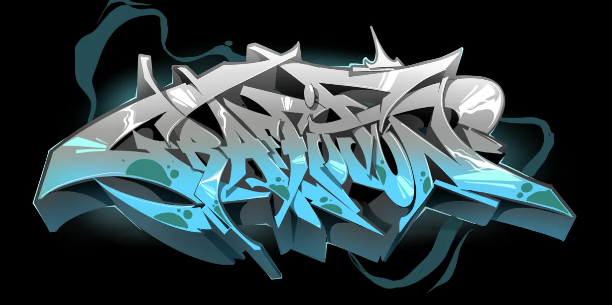
- Wildstyle: Highly complex, intertwined letters that are often difficult for the untrained eye to read. This is considered an advanced form of letter-based art.
- Semi-wildstyle: A balance between legibility and complexity, perfect for intermediate artists.
- 3D Lettering: Focusing on the illusion of depth, using vanishing points and perspective.
Workshop suitability and audience fit
One of the reasons letter-based graffiti is the foundation of our workshops is its accessibility. Regardless of previous artistic experience, everyone has a relationship with the alphabet. We can teach a child to draw a "bubbly" version of their name, or guide a corporate team through the technical process of creating a large-scale Piece reflecting company values.
Skill level and time investment
While the basics can be grasped in a single 2-hour session, mastering the art of the letter is a lifelong pursuit.
- Beginner (1-5 sessions): Focuses on basic letter structure, simple 3D shadows, and "fill-in" techniques.
- Intermediate (Months of practice): Mastery of "swing" (the flow of letters), consistent spacing, and basic Spray paint blending.
- Advanced (Years of practice): Developing a signature style, complex 3D perspective, and intricate backgrounds.
Essential tools and techniques
Creating professional-looking letters requires more than just paint. Understanding your equipment is vital. This includes selecting the right Cap types for different parts of the letter. For example, a "Skinny Cap" is essential for clean outlines, while a "Fat Cap" is best for filling in large areas quickly.
Technique-wise, the "cut-back" is perhaps the most important skill. This is the process of using the background colour to "carve" into the letter, sharpening the edges and fixing mistakes. It is this attention to detail that separates a messy tag from a professional-grade letter piece. ⚡
Conclusion: Why letters matter
Letter-based graffiti is more than just "writing on walls"; it is a sophisticated form of abstract typography. It challenges the artist to find balance, rhythm, and flow within the constraints of twenty-six characters. Whether it's a simple tag or a complex burner, the letter remains the heartbeat of the global graffiti movement. By participating in a professional workshop, you don't just learn to paint; you learn to see the alphabet through an entirely new lens.
Expert Attribution
This guide was developed by the professional artists at Graffitifun. With years of hands-on experience in urban art education and thousands of successful workshops delivered globally, our team specializes in breaking down complex letter structures into achievable steps. We prioritize safety, high-quality materials, and authentic artistic expression in every session we lead.
Frequently asked questions
Keep reading
Ready to Create Your Masterpiece?
Book your graffiti workshop today and discover the artist within! It's going to be AWESOME!