Graffiti shading techniques
Learn professional graffiti shading techniques. Master gradients, 3D effects, and light sources with our expert guide for beginners and advanced artists.
Shading is one of the most transformative skills a graffiti artist can master. It is the technical process of creating gradients and shadows to give a flat piece the illusion of depth, mass, and three-dimensional form. Whether you are aiming for the razor-sharp looks of a burner or the soft, realistic transitions of aerosol art, understanding how to manipulate spray paint for shading is crucial. In this guide, we draw upon years of hands-on experience from the professional graffiti artists at Graffitifun to break down the mechanics of light, the best equipment to use, and the step-by-step exercises you need to elevate your work from flat letters to 3D masterpieces. 🎨
Understanding the importance of shading in graffiti
In the world of urban art, shading is the bridge between a flat, two-dimensional drawing and a vibrant, three-dimensional masterpiece. Whether you are working on a graffiti piece or a large-scale mural art project, mastering the transition from light to dark is essential. Shading provides depth, volume, and realism, allowing letters to "pop" off the wall and characters to inhabit a physical space.
Professional graffiti artists use shading to direct the viewer's eye and create mood. By understanding how light interacts with surfaces, an artist can transform a simple fill-in into a complex work of art. This guide explores the fundamental and advanced techniques used by the Graffitifun team to achieve professional-grade results. 🎨
The science of light and shadow
Defining your light source
Before pressing the nozzle, you must decide where your imaginary light is coming from. In graffiti, this is usually from the top-left or top-right. Once the light source is established, every shadow must be placed consistently on the opposite side of the letters or shapes. Inconsistent shading is one of the most common mistakes beginners make, resulting in a confusing visual hierarchy.
Core shadows vs. drop shadows
There are two primary types of shadows in graffiti:
- Core Shadows: These occur within the letters themselves, suggesting curvature and depth.
- Drop Shadows: These are cast onto the background, making the entire piece appear as if it is floating in front of the wall.
Step-by-step guide to basic shading
Step 1: The base layer
Start with a solid, even fill-in. Choose a mid-tone colour that will serve as your canvas. Ensure the paint is dry enough to layer over without excessive bleeding unless you are specifically aiming for a wet-on-wet blend.
Step 2: Identifying the "dark" zones
Identify the areas furthest from your light source. If your light is top-left, your shadows will be on the bottom and right edges of every bar and curve in your letters. Use a darker shade of your base colour to map these areas out lightly.
Step 3: The "Dusting" technique
Hold the spray can further away from the wall (about 15-20cm). Use a soft-pressure cap, such as a gold or blue-dot cap. Lightly "dust" the paint onto the transition zone. This creates a grainy gradient rather than a hard line, mimicking how light naturally dissipates. 💨
Step 4: Hard edges and depth
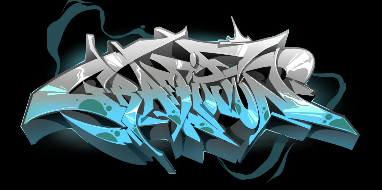
To finish, use a skinny cap to add a sharp, dark line at the very edge of the shadow. This contrast between the soft gradient and the hard edge creates a professional "3D" effect common in burner graffiti.
Beginner vs. advanced adaptation
For Beginners: The Two-Tone Method
Beginners should focus on using just two shades of the same colour: a light base and a dark shadow. Focus entirely on consistency. If you decide the shadow is "down and to the right," ensure every single part of the letter follows that rule. Practice on a blackbook first with markers to understand the geometry before moving to the wall.
For Advanced Artists: The Multi-Layer Fade
Advanced shading involves "transitions" or "fades." This uses 3 to 5 shades of a colour family. For example: Deep Navy -> Royal Blue -> Sky Blue -> White. Advanced artists also incorporate "reflected light"—a thin strip of lighter colour on the very edge of the shadow side, suggesting light bouncing off the ground back onto the object.
Equipment recommendations for perfect gradients
The tools you choose significantly impact your ability to shade effectively. In our professional workshops, we recommend the following setup:
- Low-Pressure Cans: These allow for more control and slower paint output, which is vital for building up gradients slowly.
- Cap Selection: Use "Soft Caps" or "Lego Caps" for gradients and "Skinny Caps" for details. Check our guide on cap types for a full breakdown.
- Transparent Cans: Some manufacturers offer "transparent" black or white paint specifically designed for shading without completely covering the base colour.
Common errors and how to fix them
The "Muddy" Effect
Problem: Colors look dirty or grey because too many dark tones were mixed haphazardly.
Fix: Use a clean "bridge" colour. If transitioning from red to black, use a dark burgundy in between to maintain colour vibrancy.
Inconsistent Light Source
Problem: Shadows appear on different sides of different letters.
Fix: Draw a small sun or arrow in the corner of your work area as a constant visual reminder of where the light is coming from.
Hard Lines in Gradients
Problem: The transition looks like stripes rather than a smooth fade.
Fix: Increase your distance from the wall and move your arm faster. Use "flicking" motions with your wrist to taper off the paint flow. 🖌️
Training progression for aspiring artists
- The Sphere Test: Practice painting a perfect 3D sphere on a flat surface. Transition from a bright "hot spot" to a deep shadow with a reflected light edge.
- The Box Method: Practice shading simple 3D blocks. This helps in understanding how shadows behave on sharp corners, which is essential for wildstyle graffiti.
- Vertical Fades: Practice shading an entire wall from dark at the bottom to light at the top. This builds muscle memory for finger pressure and arm movement.
Practical workshop application
At Graffitifun, we believe shading is best learned through hands-on experience. In our sessions, we often use "shading templates" to help participants understand the physics of light. Whether it's for branding workshops or creative team building, we teach participants how to use shadows to make their company logo or name stand out with professional flair. We provide all the specialized low-pressure cans and soft caps needed to ensure even a first-timer can achieve a smooth fade. 🚀
Professional insights: Expert attribution
This guide was compiled by the senior artists at Graffitifun, drawing from over a decade of worldwide experience in urban art education. Our professional team has painted everything from technical burners to massive commercial murals. We have refined these shading techniques through thousands of workshops, ensuring that the methods we teach are not only artistically sound but also accessible to students of all skill levels. We pride ourselves on safety, technical precision, and the joy of sharing the "secret" techniques of the graffiti world with the public.
Frequently asked questions
Keep reading
Ready to Create Your Masterpiece?
Book your graffiti workshop today and discover the artist within! It's going to be AWESOME!