3D depth creation
Master 3D depth in graffiti with our expert guide. Learn perspective, vanishing points, and spray techniques to make your art pop off the wall.
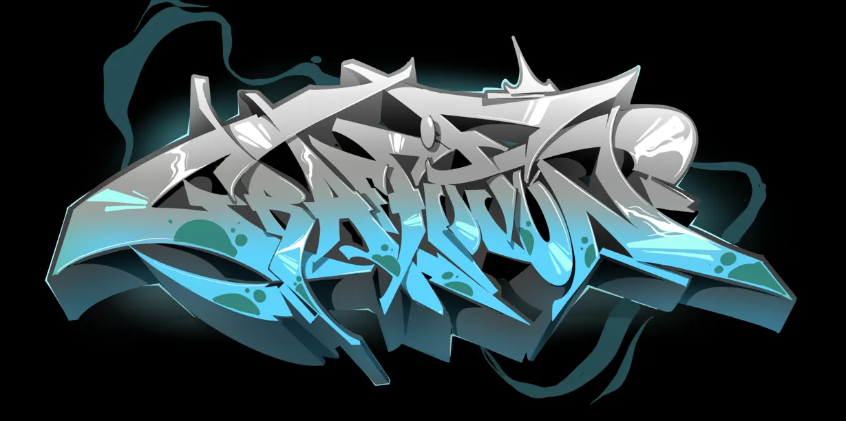
Creating 3D depth is a transformative skill in graffiti art, turning flat letters into architectural forms that pop off the surface. Whether you are aiming for a classic "block" look or a complex perspective-driven piece, understanding the mechanics of depth is crucial. This guide covers everything from basic drop shadows to advanced vanishing point techniques. Drawing on years of hands-on experience by professional graffiti artists, we will explore the geometric principles and spray paint techniques required to master the Z-axis. By the end of this article, you will understand how to manipulate light, shadow, and perspective to give your urban art a professional, three-dimensional edge. 💥
The fundamentals of 3D depth in graffiti
In the world of urban art, 3D depth is the technique that separates a flat 2D piece from a dynamic, architectural masterpiece. By mastering the illusion of three dimensions, an artist can make their letters appear to jump off the wall or recede into the distance. This technique is not just about drawing extra lines; it is about understanding light sources, vanishing points, and spatial geometry.
Professional graffiti artists spend years refining their 3D techniques, moving from simple "block" letters to complex "vanishing point" perspectives. Whether you are working in your blackbook or executing a large-scale mural, understanding how to manipulate the Z-axis (depth) is essential for any writer looking to advance their style. 🎨
Core concepts: Block vs. Perspective 3D
Before picking up a spray can, it is vital to understand the two primary ways depth is created in graffiti.
The Block 3D (Parallel)
This is the most common entry-point for beginners. In a block 3D, all the depth lines move in the same direction at the same angle (e.g., all moving down and to the left). This creates a sense of thickness but does not necessarily simulate realistic perspective. It is highly effective for throw-ups and simple pieces because it is fast and consistent.
Perspective 3D (Vanishing point)
Advanced artists use a "vanishing point"—a single point on the horizon where all depth lines converge. This creates a more realistic, photographic sense of depth. As letters get further from the center, the 3D becomes more dramatic. This is a staple in wildstyle graffiti, where complex letter structures require a unified sense of space to remain readable.
Step-by-step: Creating 3D depth with spray paint
Creating professional depth requires a systematic approach. Follow these steps to ensure your 3D looks solid and intentional.
Step 1: Establishing the outline and light source
Complete your main letter outlines first. Once the letters are set, decide where your light source is coming from (e.g., top-left). This decision dictates where your shadows will fall and where your 3D blocks will be "extruded" from the letters. If the light is top-left, your 3D should generally move toward the bottom-right.
Step 2: Plotting the 3D lines
Using a lighter colour or a "sketch" can, draw lines coming from the corners of your letters. If you are doing a vanishing point 3D, all these lines should point toward a specific dot you've placed on the wall. Ensure these lines are consistent; if one corner has a 3D depth of 10cm, all corresponding corners should feel proportionally accurate.
Step 3: Connecting the backs
Connect the ends of your depth lines. This creates the "back" of your 3D block. These lines should mimic the shape of the original letter outline. This is where most beginners struggle—remember, if the top of your 'E' is a horizontal line, the back of the 3D for that 'E' should also be a horizontal line.
Step 4: The fill-in and shading
Fill the 3D area with a colour that contrasts with your main letters. To add even more realism, apply shading techniques. Walls that face "up" should be slightly lighter, while walls facing "down" should be darker. This simulates how natural light hits a 3D object. 🖌️
Training progression: From beginner to advanced
Beginner level: The "Drop Shadow"
Start by simply duplicating your outline slightly lower and to the side. Don't worry about connecting the lines yet. This creates a "hovering" effect and teaches you about directional consistency.
Intermediate level: Single-direction block
Force yourself to connect every corner. Practice keeping your angle (e.g., 45 degrees) identical across the entire name. This builds the muscle memory needed for can control mastery and spatial awareness.
Advanced level: Multi-point perspective and 'Ribbon' 3D
Incorporate multiple vanishing points or "ribbon" blocks where the 3D twists and turns like a piece of folded metal. At this stage, artists often incorporate spray paint blending within the 3D to create "core shadows" and "reflected light."
Equipment recommendations for 3D work
The right tools make technical depth much easier to achieve. Our professional artists recommend:
- Skinny Caps: Essential for the fine lines required to connect corners. Use these for the initial 3D mapping and final "power line" (the line that separates the letter from the 3D).
- Low-Pressure Cans: These allow for slower, more deliberate movements. When you are calculating perspective on the fly, you don't want a high-output can making a mess.
- Chalk or Charcoal: Many professionals use chalk to mark their vanishing point and guide lines before spraying. This ensures the geometry is perfect.
- Translucent/Transparent Paints: These are excellent for adding subtle shadows over your 3D fill-in to enhance the depth without losing the base colour.
Common errors to avoid
Even experienced writers can make mistakes when 3D gets complex. Look out for these pitfalls:
- Inconsistent Angles: If the 3D on your first letter goes down-left and the last letter goes straight-down, the piece will look "broken."
- Ignoring the "In-Betweens": Don't forget the 3D inside the holes of letters (like the middle of an 'O' or 'D'). If the outside has depth, the inside must have it too!
- Losing the Outline: If your 3D colour is too similar to your letter colour, the depth disappears. Use a "cut-line" or a high-contrast outline control to keep the letters distinct.
- Flattening the Backs: Always ensure the back of your 3D follows the contour of the letter. If the letter is curved, the back of the 3D must be curved.
Practical application: Workshops and murals
In a workshop setting, we often teach 3D depth by using physical props. By holding a wooden block up to the light, students can see exactly where the shadows fall. When translating this to a wall, we encourage participants to use their "can-arm" as a compass, pivoting from the elbow to maintain consistent angles. 🚀
For large murals, the "string method" is often used. A piece of string is taped to the vanishing point and pulled to each corner of the letters to ensure every single 3D line is mathematically perfect. This professional approach ensures that even from a distance, the 3D looks solid and structurally sound.
Conclusion
Mastering 3D depth creation is a milestone in any graffiti artist's journey. It transforms a simple name into a powerful, architectural statement. By focusing on consistency, understanding light, and practicing layering techniques, you can bring a whole new dimension to your work. Remember, the goal of 3D is to give your letters weight and presence—make them look like they could be carved out of stone or forged from steel.
Expert Attribution: This guide was developed with insights from our professional graffiti artists at Graffitifun. With years of hands-on experience in both street art and urban art education, our team specialises in breaking down complex technical skills into accessible, actionable steps for artists of all levels.
Frequently asked questions
Keep reading
Ready to Create Your Masterpiece?
Book your graffiti workshop today and discover the artist within! It's going to be AWESOME!